Zaid Bin Talib
Tuesday, January 7, 2014
Monday, January 6, 2014
Sunday, January 5, 2014
Mutant Design Approach
Labels:
3ds Max,
Academic,
Design,
Parametric,
zbt
Saturday, October 12, 2013
Mousque
Competition Project: Parametric Approach
Islamic art represents one of the oldest art forms, its history and legacy reaches far back histories and yet it still relevant in contemporary works and is full of untapped potentials. Geometric patterns make up one of the three non-figural types in Islamic art. Using contemporary modes of computation; such as scripting and free form modelling allows us to depart from conventional typologies of Islamic domes. Fabrication techniques for prototypes such as 3d printing, 3d milling and laser cutting, along with innovative use of emerging and existing materials, gives us the freedom to extend the existing boundaries and hopefully lead to new typologies in Islamic domes.
By using computational mode was generated from 4 sided Polygons which is one of the fundamental components of the traditional Islamic geometries. It departs from the existing typologies by using the same base geometries but differentiating the combination and duplication order. This method enables us to achieve novel geometrical organizations, yet remain culturally rooted. Our current fabrication technique allows for a great range of flexibility.
The project is a proposal for Mosque which explore the emergent qualities derived from surfaces modulation in an intensive fields, aiming to equilibrium states of program, structure and function through morphodynamical processes.
At a global scale the system explore how the modulation of isosurfaces, based on intensive field from site analysis data, can achieve highly differentiated spaces and performative structures.
The project uses a generative methodology to test multiple solutions based on the same process from which was selected the one that represent the best compromise between structural performance, program and connections.
Form, structure, function and decoration are emergent qualities of the same coherent system strictly related to his environment.
Labels:
Analysis,
Animation,
Competition,
Grasshopper,
Parametric,
Religulous,
Rhinoceros,
Sustainability,
zbt
Tuesday, October 8, 2013
Mutant Block Aggregation
Parametric Wall
"Mutations are the basic elements by which evolutionary processes can take place."
"Parametric design is the first step to understand that changes, variations and information are the worlds foundations and matter properties, that will bring your mind to the doorstep of the boundless land of complexity."
As a means to get things started, I am posting an early parametric project that was designed for a gallery installation at the School. Using block surfaces, I developed a wall in which each part would be specific to its location in the assembly. Each block could work to brace one another, giving the system an accumulated rigidity.
Another key aspect of this research is in the investigation of material efficient form that can be completely nested on a clay or gips material. While this project is not zero waste, one can see the potential of such forms from a flat sheet.
The Parametric Walls project involves accumulating networks of simplified geometrical parts into larger useful whole masses. In this example, for a retaining wall system, Unit is designed to precisely interlock with its neighbor, allowing for a wall that curves in both plan and section, and therefore allows for a more precise distribution of weight and force both laterally and vertically. The primary intended uses for this particular system are as retaining walls for soil as well as strategic break-walls for tides and coastal wave surges.
The parametric wall system generates units geometry, subtracts material overlaps, and organizes stacking of customized bricks to offset horizontal loading pattern. Parawall requires less vertical load than typical retaining wall systems, and produces a more strategically calculated "lean" efficient, which better offsets soil pressure on retention side.
The model is 3d computerized-made by Rhinoceros and Grasshopper.
Labels:
Academic,
Analysis,
Animation,
Grasshopper,
instillation,
Mutant Aggregation,
Parametric,
Rhinoceros,
Sustainability,
zbt
Saturday, October 5, 2013
Mutant Aggregation #00
One of the oldest green building materials known to humankind, bricks have great thermal mass and last almost forever. But laying them takes skill, and complex forms and shapes are hard to design and build. Unusually, today we happened upon a story about bricks that doesn't involve Lego. Reassuringly, it still involves robots. It have re-purpose an industrial robot to create an intricate clay brick sculpture. The accuracy that will afforded by industrial robotics enables the placement and structure of the bricks themselves to create a sculpture that "lifts off the ground" without the use of mortar. Presents a digitally generated and fabricated wall consisting of clay bricks.
Using a modular unit
of the masonry brick that developed a systematic aggregation creating a curved wall
that inspired by Dome. The wall’s double layered running bond varies from a straight
line to a maximum undulation, which creates an inhabitable space "Fireplace".
The emerging space
and pattern is the resultant of a set of principles (algorithms) applied to a
simple rectangular brick module, taking into account its material and technical
parameters. The scale, precision, and vast number of units of the final design
scheme necessitated an automated process based on script and robotic
construction. A feat impossible to achieve by human hand due to the labor-intensive,
precise nature of the task.
The approach that has
been taken with this “Fireplace gathering” which includes the task and the robot,
as well as the finished sculpture, in the work of art. It's about time robots
were acknowledged for their tireless efforts. It's becoming quite the artist.
The Project is the
outcome of a synthesis of computer generated design and computer aided
construction research.
Going beyond the
model scale, and planing to work with the Robotic arm set up new design
challenges which were tightly linked to the construction techniques, material
constraints, and structural limitations encountered in full scale building
modus.
Ultimately the design
manifests the performative potential of bricks, expressed through the wall’s curvature
and porosity as it affects the acoustic and visual qualities of the wall-space
created. Using digital technology these affects were pushed to a new extreme. Overall
the project hopes to highlight the potential of digital fabrication techniques
and the role these have in the education of architects.
For 3D Navigation: please visit this link: http://sketchfab.com/nmkj3h10a
For 3D Navigation: please visit this link: http://sketchfab.com/nmkj3h10a
Labels:
Academic,
Analysis,
Animation,
Grasshopper,
instillation,
Mutant Aggregation,
Parametric,
Rhinoceros,
Sustainability,
zbt
Thursday, October 3, 2013
Mutant Aggregation Thesis "No Furniture"
There seem
to be so many ways to want to sit or lie down that no couch, chair or bench
design could possibly accommodate them all, right? Well, this industrious and
dedicated pair of designers and artists set out to prove that theory wrong with
Sitscape, a custom seating solution that combines elements of rigorous
scientific analysis with creative design synthesis.
The sinuous shape of the “Portable Fireplace Couch” has been inspired by natural rock formations shaped by erosion: the application of subtractive processes that carve solid matter. The resulting formal language gives the piece increased ergonomic properties without compromising the design’s proportion; translating into a concept that allows for multiple seating layouts. The carved profile incorporates deep backrests and generous undercuts for unrivaled comfort.
The sinuous shape of the “Portable Fireplace Couch” has been inspired by natural rock formations shaped by erosion: the application of subtractive processes that carve solid matter. The resulting formal language gives the piece increased ergonomic properties without compromising the design’s proportion; translating into a concept that allows for multiple seating layouts. The carved profile incorporates deep backrests and generous undercuts for unrivaled comfort.
Using an
almost architectural approach to this furniture design problem, the pair
started by mapping out the various possible configurations for and needs of the
users, balancing the results in a functional-but-stylized way in three
dimensions. The result: a creative and complex form that is both artistic and usable,
conforming to different basic sitting and laying positions but also unique in
shape and form.
Laying
emphasis on modern aesthetics, it has basic premises as an object that tumbles
to attain multiple orientations to blur the qualification plans and sections.
It tumbles and changes orientation and can flip to many different stances.
What is a building that can tumble freely without gravity or fixed
orientations, this installation is a freestanding furniture that questions
projection, inside/outside, rigidity/fluidity and size/scale. It's a flippable
object, able to be tilted and set on any side, offering a place to sit in any
orientation. Perfectly inhabiting the otherwise inexact and under-explored midspace
between architecture and an outside fireplace or couch or grill.
At first
glance, the “Portable Fireplace Couch” left me flummoxed since no
conventional label can be applied to it. A sculpture, a bench, or a UFO are
only some of the images that popped up into my head. However further exploration
makes it clear it is open to interpretation. It also illustrates how it can to
pushing design boundaries that yield a more futuristic result.
In fact,
the sight of this thing looming all alone in a free landscape or garden park
makes it seem more powerful than it really is, I'd suggest, as it appears, in
many ways, to invalidate the boundaries around it. This variation allows
Portable Fireplace Couch to reposition incessantly and becomes spatially and
materially coextensive with the fireplace and couch itself.
There are
more illustrations showing the spatial object being flipped, as the following,
truncated sequence demonstrates and the diagrams reveal the variety of facets
the object requires.
But it
would also be interesting, given more time, to see many more spatial variations
on the same basic idea, but also to explore the effect of different materials,
finishes, and colors. You select the geometry, the interior, the
upholstery—maybe even small, medium, or large—and soon enough your very own
piece, ready for assembly.
It’s the
surprise factor combined with a design autonomy that makes this product so
noteworthy. This foresight necessitates working towards the ‘No Furniture’
concept where perception and convergence usurp the humdrum rhythm of urban life.
Labels:
Academic,
Analysis,
instillation,
Mutant Aggregation,
Parametric,
Rhinoceros,
zbt
Monday, September 30, 2013
Gravestone
Grave to my lovely Father
Its a design for grave to my lovely Father that constructed in Norway - Trondheim.
I tried to make an indication of the soul by the openness in the center; that return to the sky. And the name of my lovely father that shaped by Arabic calligraphy in the half-moon (Crescent) inside of the monument. The wings that shaped the monument from the outside gives an indication for the goodness that my lovely father have it. And the main idea that I tried to use in this monument is the openness and simplicity.
The grave constructed by red & black granite, and the Islamic ornamentation that shaped by water-jet technique.
All what I tried to do is to giving a small thing back to my big Hero and my best friend (My lovely Father).
3D navigate: http://sketchfab.com/nlhgfeca
Read more .....
Labels:
3ds Max,
Animation,
Religulous,
Rhinoceros,
Sustainability,
zbt
Sunday, June 30, 2013
Green Prophet
Green Prophet
Student Proposes Iraq Embassy Design for Oslo a la Zaha but Greener
by Tafline Laylin, 06/30/13
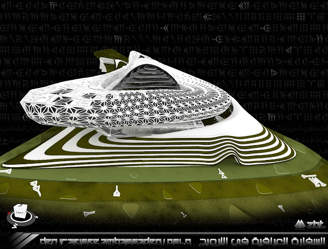
Zaha Hadid’s flowing architecture instantly sprung to mind when we came across Zaid Bin Talib’s design proposal for an Iraqi embassy in Oslo. Daring, futuristic, and swooping, the design appears to be influenced by Iraq’s most famous architect’s style, except the Oslo School of Architecture and Design student’s work is so much greener.
So many people rave about Zaha Hadid’s work, and with good reason. She’s a genius who constantly reinvents herself, an original.
But we can’t bring ourselves to support an Iraqi who refuses to do more for the environment through her deeply influential work, unless you count the LEED Silver SOHO Gallery Complex.
But Zaid Bin Talib? Now there’s a designer we can get behind.
The proposal for a new embassy in Norway demonstrates an environmental ethos that puts the Iraqi elder to shame, yet the budding student hasn’t compromised one inch of innovation to achieve his eco-ambitions.
One quarter of the punctured facade is covered with photovoltaic panels and 30 percent with greenery that unfurls among the undulating openings.
The energy-generating skin is complemented with high-performance glazing covering the openings, which help to ensure the building’s interior in both well-lit and ventilated.
Oriented towards the west entrance to protect against high winds and comprised of two polarized “swirls” that create a continuous, long structure, the embassy’s northern facade is closed to block out traffic noise.
Other sustainability initiatives include energy efficient lighting and passive solar design, all of which help to reduce this impressive structure’s impact on the earth. Mind you, it’s not dirt, and it’s not affordable, but it is a step in a greener direction.
Maybe this particular design won’t be realized, but it’s refreshing to know that the next generation of designers from the Middle East and North Africa are incorporating real-world issues into their work.
Now, how do we teach the old schoolers (ahem, Zaha) a few new, green tricks?
Labels:
Academic,
Embassy,
Publish,
Sustainability,
zbt
Saturday, June 29, 2013
inhabitat
inhabitat
Zaid Bin Talib Unveils Plans for Solar-Powered Rainwater-Harvesting Embassy of Iraq in Oslo
by Lidija Grozdanic, 06/28/13
Oslo School of Architecture and Design student Zaid Bin Talib recently unveiled plans for a new Embassy of Iraq in Oslo that is covered in solar panels and rainwater harvesting mechanisms. The swirling structure features an energy generating skin, and it's wrapped with vegetation that intertwines throughout its openings and undulating surfaces.
The intersecting swirls of Zaid Bin Talib‘s Embassy of Iraq in Oslo create an interesting play of animated forms. The skin provides gradual and discrete connections between different parts of the building. The two polarized swirls create a continuous and, at times elongated circulation path.
Serving as an urban sculpture, the overall shape of the building gestures towards the open spaces on the west side of the site. The north façade is mostly closed and functions as a buffer against traffic noise. Access, openings and views are oriented towards the east and shielded from winter winds.
The undulating roof is covered with photovoltaics and it harvests rainwater to irrigate the surrounding vegetation. The openings are glazed with high-performance glass that reduces glare and provides views and shading.
Labels:
Academic,
Embassy,
Publish,
Sustainability,
zbt
Monday, June 24, 2013
Embassy of Iraq - Oslo, Norway
A new embassy with ambassador’s residence in Oslo, Norway
Extract:
An embassy is a reflection of its country and its silent messenger that complements as well as completes the Ambassador’s mission.
The name of Iraq has become a strong reminder of war, atrocities, and suffering not soon forgotten, as it fought to carve its identity. Iraq seeks much needed support to overcome the painful years of civil war and looks to friendly nations that understand its pain and its strive to build a better future. Iraq is viewed as a rich and influential country, their heritage and traditions reflected by the fastest expanding civilization in the world. A world where traditions are being lost, easily discarded, and abandoned.
Iraq almost lost everything including their beliefs and faith in humanity, in face of a horrific and devastating war not seen in Europe since World War II, a gleam of hope ended the fight and life rose again from the ashes of pain and suffering.
Today, only the present and future matter and need be strengthened. We find strength not only in ourselves, but also in family and friends in life. Thus, the message of the hope coming from the warm desert of Arabia is bold and strong and has to be shown in the architectural representation of the embassy.
This research seeks to shed light on what an Iraqi embassy in Norway capital is. It discusses to what extent an embassy can showcase the ideals and the cultural values of the country it represents, what its role is, and to what extent it is a building that should try to conform to the local setting.
The House of Iraq in Norway fulfills the role of embassy purely as a representative of goodwill. I want to focus on developing a national symbol for the new spirit of Iraq. The new building should be a symbol of the Iraqi’s role in the development of Iraq and a reflection of the determination to rebuild the country.
http://zaidbintalib.wix.com/zaid-bin-talib
Labels:
3d Printing,
3ds Max,
Academic,
Analysis,
Animation,
Embassy,
Parametric,
Publish,
Rhinoceros,
Sustainability,
zbt
Series Of Massive attack project "Extravaganza" Mutant Baby#02: Jellyfish (Museum)
An experimentation of the horrific aesthetic.
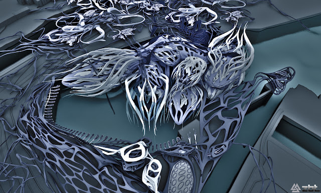
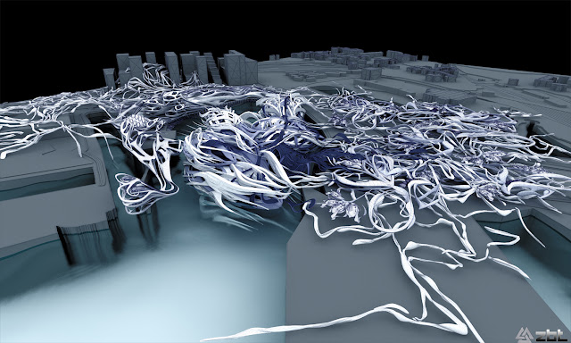
The project is an experimentation of using the horrific aesthetic in excessive way in the Urban Design. And its the Second version of series called "Mutant Baby", which is a thesis of massive attack project "Extravaganza". The thesis will focused and investigated, essentially, how that New Horrific Aesthetic will change the Paradigm of Metropolitan Behaviour. By using the Advanced Computer Technology to explore the limits of architecture, and the create a scenarios of where architecture can go if driven by these ideas.
To investigate architecture beyond forms which aims to present an updated view of Computation and Digital research in architecture, because design was no longer concerned with presentation but rather with Calculation & Computation which would profoundly affect architecture production methods.
I try to develop innovative and unusual solutions to problematic of location, connection, dislocation, and disconnection, re-working the tension between the building as a Hyper Generic Spaces and as a specific environment.
The model is not that of transparency and structure but rather one of cuts, inserts, nip & tuck, like a horror films, the hand of a plastic surgeon that manipulates matter. The Horrific transmutations of bodies and faces becomes the material organizations and design expertise. These mutations have the capacity to create Bi-Products, Emerging Aesthetics and Paradigms.
Architecture has been operating of classical paradigms of Beauty & Production, within the last 20 years new techniques and technologies crated a new frame of aesthetic conditions that has not been critically re-configured, the thesis will attempt to produce a series of definitions regarding this issues.
Greg Lynn said “ the best hope for change isn’t in the heroic Creation of singular instance but to absorb into the mixture; to spread like a virus into the blood, horrifically affecting the neighbours until the entire solution has changed colour”.
Historically, architecture begins with a Concept, an overall strategy or some kind of pre-meaning. This thesis proposed a re-examination of the possibility of form generation as an autonomous act. in particular the notion of space and form as an embodied experience.
Building process involved an intimate connection between thinking, designing and implementing.
Typology (like Museum) has been one of the complex territory for the dynamic topology model to conquer. If museum are primarily intervened by means of their topological strength, we will grow them by means of their topological intensity. We will develop active nesting techniques whereas the inner body is not a sequential proliferation but rather a discontinuous organic growth, at the same times this inner mass will stench in/out the outer flesh.
Flesh differs from Surface for its layered nature, it cannot be detached from the inner organs, it is just one more coat, it is deeply attached, it stretches and compress for the sake of smoothness, porosity and voluptuous.
The aim of the thesis confronted the (project) as an institution and as a visual presence to explore its architecture as a continually emerging atmospheric condition of form, culture, geometry, fear, and compression.
The project focused on this new potential by proposing a network of multiple, continuous spaces, not defined by geography but by time. The thesis will organized more like an experimental-research effort than a typical academic thesis . We employed Maya and other dynamical modelling software and made use of 3d printing capabilities, beginning by developing a set of architectural techniques …. A system of prototyping. its first advanced a sort of cultural catalogue of affects, and then looked at incremental system variation, aspects of the utilization of systemic conditions that allowed for the increasing intimacy of a mobile and electronically networked biological culture.
I try to develop innovative and unusual solutions to problematic of location, connection, dislocation, and disconnection, re-working the tension between the skyscraper as a Hyper Generic Spaces and as a specific environment.
The model is 3d computerized-made by Maya and Rhinoceros.
http://vimeo.com/69077066
http://vimeo.com/69077066
More detail about the project you can find it on my website:
http://zaidbintalib.wix.com/zaid-bin-talib
Labels:
3d Printing,
Academic,
Analysis,
Animation,
Maya,
Museum,
Mutant Baby,
Rhinoceros,
Z brush,
zbt
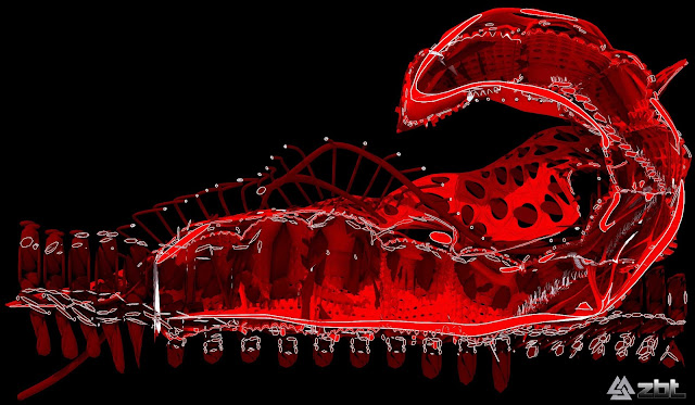
Series Of Massive attack project "Extravaganza" Mutant Baby#01: Scorpion House
An experimentation of the horrific aesthetic.
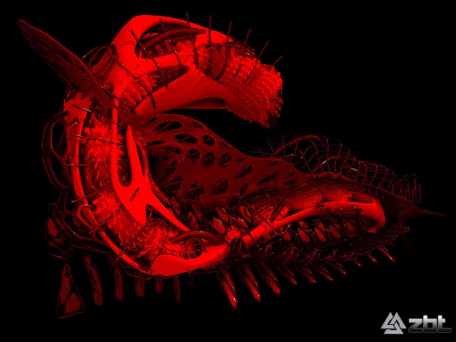
The project is an experimentation of using the horrific aesthetic in excessive way in the architectural building. And its the Second version of series called "Mutant Baby", which is a thesis of massive attack project "Extravaganza". The thesis will focused and investigated, essentially, how that New Horrific Aesthetic will change the Paradigm of Metropolitan Behaviour. By using the Advanced Computer Technology to explore the limits of architecture, and the create a scenarios of where architecture can go if driven by these ideas.
To investigate architecture beyond forms which aims to present an updated view of Computation and Digital research in architecture, because design was no longer concerned with presentation but rather with Calculation & Computation which would profoundly affect architecture production methods.
I try to develop innovative and unusual solutions to problematic of location, connection, dislocation, and disconnection, re-working the tension between the building as a Hyper Generic Spaces and as a specific environment.
The model is not that of transparency and structure but rather one of cuts, inserts, nip & tuck, like a horror films, the hand of a plastic surgeon that manipulates matter. The Horrific transmutations of bodies and faces becomes the material organizations and design expertise. These mutations have the capacity to create Bi-Products, Emerging Aesthetics & Paradigms.
Architecture has been operating of classical paradigms of Beauty & Production, within the last 20 years new techniques and technologies crated a new frame of aesthetic conditions that has not been critically re-configured, the thesis will attempt to produce a series of definitions regarding this issues.
Greg Lynn said “ the best hope for change isn’t in the heroic Creation of singular instance but to absorb into the mixture; to spread like a virus into the blood, horrifically affecting the neighbours until the entire solution has changed colour”.
Historically, architecture begins with a Concept, an overall strategy or some kind of pre-meaning. This thesis proposed a re-examination of the possibility of form generation as an autonomous act. in particular the notion of space and form as an embodied experience.
Building process involved an intimate connection between thinking, designing and implementing.
Typology has been one of the complex territory for the dynamic topology model to conquer. If house are primarily intervened by means of their topological strength, we will grow them by means of their topological intensity. We will develop active nesting techniques whereas the inner body is not a sequential proliferation but rather a discontinuous organic growth, at the same times this inner mass will stench in/out the outer flesh.
Flesh differs from Surface for its layered nature, it cannot be detached from the inner organs, it is just one more coat, it is deeply attached, it stretches and compress for the sake of smoothness, porosity and voluptuous.
The aim of the thesis confronted the (project) as an institution and as a visual presence to explore its architecture as a continually emerging atmospheric condition of form, culture, geometry, fear, and compression.
The project focused on this new potential by proposing a network of multiple, continuous spaces, not defined by geography but by time. The thesis will organized more like an experimental-research effort than a typical academic thesis . We employed Maya and other dynamical modelling software and made use of 3d printing capabilities, beginning by developing a set of architectural techniques …. A system of prototyping. its first advanced a sort of cultural catalogue of affects, and then looked at incremental system variation, aspects of the utilization of systemic conditions that allowed for the increasing intimacy of a mobile and electronically networked biological culture.
I try to develop innovative and unusual solutions to problematic of location, connection, dislocation, and disconnection, re-working the tension between the skyscraper as a Hyper Generic Spaces and as a specific environment.
The model is 3d computerized-made by 3ds Max + Grasshopper with final-touch by Z brush. Its 3d printing machine that printed it. The size of machine is 30*30*30 cm, so I tried to use the max size to print it 30*10*15 cm.
The material that was available was Strong White Plastic. It is a popular material for use with 3D printing services. This material is inexpensive compared to other materials so it's a good choice when you are starting out and want to prototype 3D objects or try out different designs. Strong plastic is flexible and strong and much more tolerant material that others of details in 3D printing design - another reason why it's good to start with. You'll see the terms Polyamide, nylon and PA 2200 used to describe strong plastic materials. This material is usually available in white and a small choice of strong colors which are applied as dyes. The powder is printed in layers and a laser melts the plastic and bonds it together to form the object. White plastic is somewhat porous and it can go yellow with exposure to the sun.
Thanks.
More detail about the project you can find it on my website:
http://zaidbintalib.wix.com/zaid-bin-talib
Labels:
3d Printing,
3ds Max,
Academic,
Analysis,
Animation,
House,
Mutant Baby,
Rhinoceros,
Z brush,
zbt
Subscribe to:
Comments (Atom)


.jpg)


